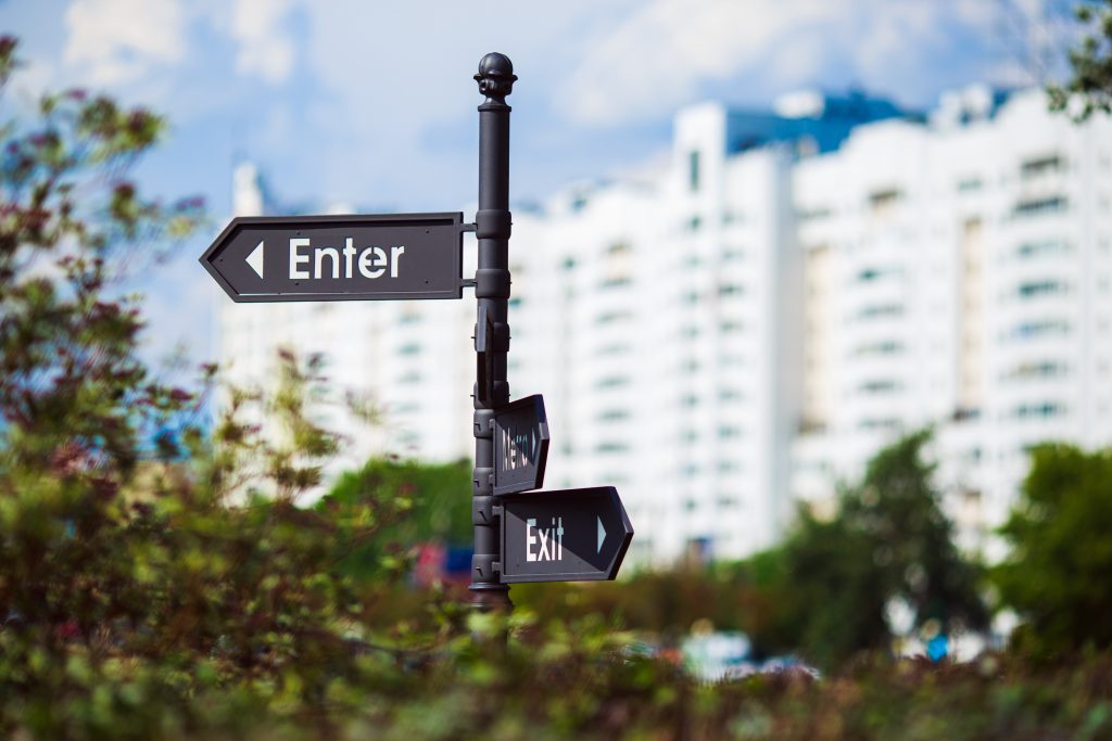
Street signs are the silent messengers of our roads and neighborhoods, guiding drivers and pedestrians alike with quick, crucial information. But not all signs are created equal, and poor sign readability can turn a helpful guide into a confusing distraction. Understanding the basics of font choice, letter size, and contrast can make the difference between a sign that works and one that goes unnoticed.
The Power of Font Choice
When it comes to street signs, the font isn’t just about style; it’s about speed. The human eye processes familiar, simple letterforms faster than ornate or decorative ones. That’s why most effective signage uses clear, sans-serif fonts that maintain legibility at a glance. The goal is instant recognition, especially when people are driving by at 30 or 60 miles per hour. If a driver has to squint or mentally decode a word, the sign has already failed.
Designers often underestimate how different fonts behave in the real world. A typeface that looks crisp on a screen might blur or distort under harsh sunlight or low lighting. Rounded letters tend to perform better because they reduce visual strain, while consistent spacing between letters helps prevent them from blending together at a distance. In short, choosing the right font is as much a safety decision as it is an aesthetic one.
Getting the Size Right
Font size is another factor that directly impacts readability. The size of a letter must match the distance from which it’s meant to be read. If a sign is placed far from a road or on a tall post, the letters need to be large enough to remain legible without effort. A rule of thumb used by traffic engineers is that every inch of letter height corresponds to about thirty to forty feet of readable distance. That means a six-inch letter should be readable from roughly two hundred feet away.
Beyond raw size, the spacing and layout of text play an important role. Tight lettering can make even large words appear cramped and difficult to read, especially under motion blur or in poor weather. A well-balanced layout gives words room to breathe and ensures that the eye can move easily from one to the next. These small adjustments can dramatically improve how quickly someone processes a sign’s message.
The Contrast That Counts
Contrast is where science meets design. The combination of background and text color determines how visible the message will be under varying light conditions. Black text on white or yellow backgrounds offers strong readability during the day, while white or light-colored text on darker backgrounds excels at night. The key is ensuring the sign has enough contrast that it stands out even when glare or shadows interfere.
This is where many poorly designed signs fall short. Faded colors, glossy finishes, or overused brand palettes can reduce contrast and make a sign nearly invisible in certain conditions. High-quality reflective materials can offset this by catching and redirecting light toward the viewer, especially for road and street signs meant to be seen in headlights. Companies like Otto’s Streetscape pay close attention to these materials and color details because they directly affect how safe and effective public signage can be.
The Psychology of Readability
Good signage design taps into how people naturally perceive information. The average driver has less than two seconds to absorb what a street sign says, so the message must be delivered in that window. Our brains don’t read every letter; they recognize familiar shapes and patterns. This means that clarity, simplicity, and predictability are crucial. The easier the brain can recognize a pattern, the faster the information is understood.
Color psychology also plays a subtle but powerful role. Red signals urgency and caution, blue conveys direction and calmness, and green indicates safe navigation. These color conventions aren’t just random; they’re built on decades of behavioral research and traffic safety studies. Ignoring them can confuse or mislead drivers, which is why professional sign designers stick to proven standards when crafting visuals that must perform under pressure.
Designing for Real-World Conditions
Perfect typography and color choices mean little if a sign isn’t tested in the environment it’s meant to serve. Outdoor lighting, weather, and surrounding landscapes all influence how readable a sign will be. A brilliant white font might pop against a forest backdrop, but it gets lost in snow or fog. Designers need to evaluate signs under real-world conditions, not just in digital mockups.
Additionally, materials matter. UV-resistant coatings and high-durability reflective films extend a sign’s lifespan and preserve color vibrancy over time. Wind, sun, and rain are relentless, and even minor fading can reduce readability dramatically. At Otto’s Streetscape, every sign is designed with longevity in mind, balancing design precision with practical durability so that clarity lasts as long as the sign does.
Balancing Function and Style
Street signs can be both beautiful and functional. The best designs communicate vital information while enhancing the surrounding environment. A thoughtfully designed street sign can complement architectural themes, highlight community branding, and elevate the overall aesthetic of a neighborhood. Yet, this must never come at the expense of readability. The art of sign design lies in merging clear communication with visual harmony.
Cities and property developers who invest in effective signage are investing in trust and safety. Clear signs make spaces easier to navigate and give residents and visitors a sense of order and care. When done right, they create a seamless flow of information that supports the identity and accessibility of a community.
The Clear Path Forward
In the end, sign readability is about communication. Every font choice, size adjustment, and color pairing contributes to how effectively a message reaches its audience. Whether you’re guiding a driver to a destination or helping pedestrians navigate a new development, clarity should always come first. The more intuitive a sign is to read, the more valuable it becomes to the people it serves.
That’s why Otto’s Streetscape is dedicated to perfecting the details that make great signage stand out. From understanding the science of visibility to mastering the art of presentation, every project reflects a commitment to clarity, safety, and design excellence. When your message is clear, your streetscape doesn’t just look better, it works better.
Partner with Otto’s Streetscape Solutions!
At Otto’s Streetscape Solutions, we’re proud to be part of that mission. Let us help you bring clarity, safety, and peace of mind to your community one light at a time. Contact us today to learn more about our lighting solutions.